This is a mini scrapbook (its about 5X5 inches) that I made out of small brown lunch sacks. This is for my friend Sheena and her new little boy Kyler.
This is just a chip board "k" that I inked with a Stampin Up chocolate chip brown marker, which is my favorite color these days.
 This first shot below is the cover without any dobbing.
This paper is one of Stampin' Ups Designer Series and I cannot remember the name, but I am sure Lindsey will read this and can enlighten us because she just knows all that kind of stuff.

This is a dobber, its this little round thing that is hollow that you can put on your finger, it has a fabric kind of end that you use to dob with.

First thing you do is put the dobber on the ink of a stamp pad. If you want just a little color then just barely tap it, if you want a lot of color, then really pound the thing!
Here are 2 of the inside layouts, just to give you some ideas. They are very simple.
I love it when things bleed from one page to the other, so I liked that Kyler's name went onto the next page.

This is what I call a "stats" page. It has lines for you to put the date, weight, etc of the baby. All the important stuff! And a spot for the picture or journaling on the right.

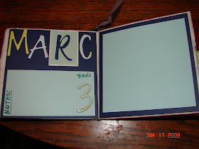
On the same day, I was making another little lunch sack scrapbook for my son's friend Marc. Mark was having a Harley Motorcyle themed birthday party. The "Wanted" part on the cover was taken from the actual invitation. The Invitation talked about the "Notorious Biker Marc" so I used that on the front page as well.

When you use these little lunch sacks, they have natural little pockets for you to use because it would be the opening of the lunch sack. So, I made little pull out pages with tabs for things like who came to the party, what gifts he got, etc.
Here is the page layout, and then to the right there is a tab that you pull out

and it looks like this once you pull it out.

And here are just a couple of the other page layouts to give you some ideas. Below, the truck is a stamp from Stampin Ups Load of Love set and then I just hand drew the Happy Birthday sign.


His Mom told me this was her personal favorite and my husband said she almost cried when she opened it! (Mark, the 3 year old had gotten distracted with another gift so she was opening them for him).
These are great gifts, and they are easy. They do take some time but you can save some money if you already have the supplies around your house.
Happy Scrapping!
Heather


No pressure. It looks like a Designer Pattern Series in the retired Blue Bayou, but I could be wrong.
ReplyDeleteCute gifts, H! :)
Yes, I believe you are correct! Thank Linz!
ReplyDeleteVery cute! Good job!
ReplyDelete